 Via an email from my friend Jorjet, I see that Helvetica is celebrating its 50th birthday this year. Helvetica comes from Switzerland, which is fitting considering its essentially neutral personality.
We should all be so functional and wildly popular as Helvetica at our half-century mark. Of course, Helvetica has its detractors as well:
“When people choose Helvetica they want to fit in and look normal. They use Helvetica because they want to be a member of the efficiency club. They want to be a member of modernism. They want to be a member of no personality. It also says bland, unadventurous, unambitious.”
I do think an over-reliance on Helvetica sometimes reveals a lack of imagination. But there are still times when its clarity and simplicity are a good thing.
And count your blessings, Helvetica. The backlash against you is nothing like the haters that Comic Sans has on its tail.
While we’re at it, let’s put that little trashy little Helvetica wannabe Arial in its place as well. Love the Tempest character, not so wild about the font.
Arial is everywhere. If you don’t know what it is, you don’t use a modern personal computer. Arial is a font that is familiar to anyone who uses Microsoft products, whether on a PC or a Mac. It has spread like a virus through the typographic landscape and illustrates the pervasiveness of Microsoft’s influence in the world.
Arial’s ubiquity is not due to its beauty. It’s actually rather homely. Not that homeliness is necessarily a bad thing for a typeface. With typefaces, character and history are just as important. Arial, however, has a rather dubious history and not much character. In fact, Arial is little more than a shameless impostor.
Yes, it seems that Arial is the Eve Harrington of typefaces, designed by Monotype as a PostScript-clone substitute for the more expensive Helvetica.
At a glance, it looks like Helvetica, but up close it’s different in dozens of seemingly arbitrary ways …. To the untrained eye, the difference [between Helvetica and Arial] was hard to spot. (See “How to Spot Arial”) After all, most people would have trouble telling the difference between a serif and a sans serif typeface. But to an experienced designer, it was like asking for Jimmy Stewart and getting Rich Little.
… True to its heritage, Arial gets chosen because it’s cheap, not because it’s a great typeface.
Oh, Arial. You can always put that price tag where your heart ought to be.
But let’s get back to Margo. In a response to Jorjet’s email, our mutual colleague Jeff pointed out that Helvetica actually has its own feature length documentary. (The image at the top of this post is taken from the film.)
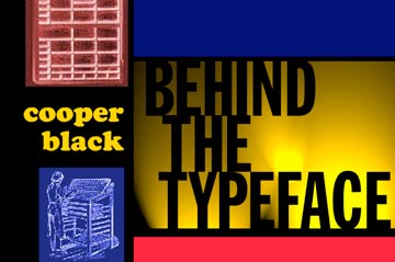
Which is pretty impressive, although my favorite documentary about a font is still this one, from 2002: Cooper Black: Behind the Typeface!

Wish I could actually embed that, but sadly it doesn’t seem to be on YouTube. Trust me though, it’s both hilarious and informative, and worth your click on the image above to go watch it where it lives.
Bonus: the best comment from the discussion thread of the Helvetica article linked to above:
Two fonts walk into the bar, and the barman says, “sorry lads, we don’t serve your type”.
JB, Gerrards Cross
Oh, I was kerning for a good joke like that.

No Comments so far ↓
Like gas stations in rural Texas after 10 pm, comments are closed.